A lot of websites look active without being effective. They attract attention, but they do not make the next step feel clear enough, easy enough, or convincing enough to turn that attention into business.
Traffic Is Not the Same as Opportunity
Many businesses assume the website problem is traffic. Often it is not. They are already getting enough visitors to learn something useful, but the site is too unclear or too weakly structured to turn that interest into action.
Improving conversion means your existing traffic becomes more valuable. The same visitors and the same marketing spend can suddenly produce better results.
Your Value Proposition Might Be Too Vague
When a visitor lands on your site, they should know quickly what you do, who you help, and why your offer is worth considering. If the page leads with generic statements or brand slogans without practical meaning, confusion sets in fast.
A homepage or service page should not make the user decode your business. It should remove uncertainty immediately.
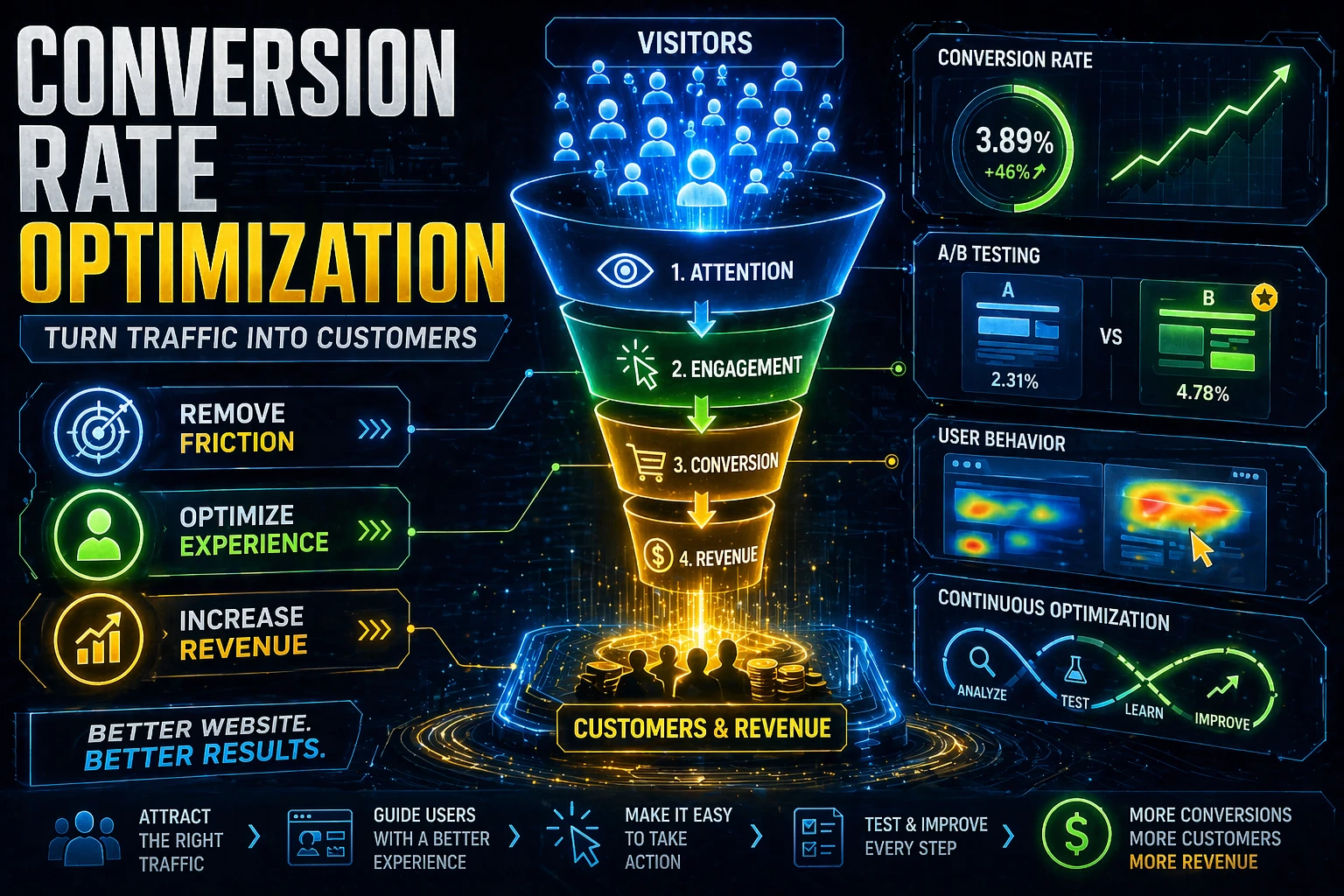
Weak Calls to Action Create Hesitation
A lot of sites technically have a call to action, but it is not strong enough to guide behaviour. It may be buried, too soft, too general, or disconnected from the real buying stage of the visitor.
The best calls to action feel specific and proportionate. They tell the user what happens next and make the next step feel simple.
Trust Signals Are Often Missing
Before people contact a business, they look for proof. Reviews, testimonials, portfolio examples, client logos, and expertise markers all reduce risk.
If your page asks for action before it earns confidence, conversion suffers.
Mobile Experience Still Breaks Good Intent
Most businesses underestimate how much mobile friction hurts enquiries. A beautiful desktop page can still perform poorly on phones if the layout is clunky, the text is hard to scan, or the form feels annoying.
Conversion work must include mobile reality. That means fewer distractions, stronger hierarchy, faster load times, and cleaner paths to call, message, or submit an enquiry.
A website does not need to be beautiful first. It needs to be clear, believable, and easy to act on.
Your Forms May Be Asking Too Much
Long forms, unclear questions, and awkward layouts quietly reduce completion rates. Businesses often ask for information they do not need at the first stage because it feels useful internally.
The first conversion should feel light enough to complete without resistance while still giving your team what it needs to qualify the lead.
The Page Might Not Match the Source
Someone coming from a branded search behaves differently from someone arriving through an ad or a social post. If your landing page does not match the promise that created the click, trust weakens immediately.
This is one reason ad campaigns often underperform. The traffic is fine. The landing experience is misaligned.
What to Improve First
Start with the pages that have high traffic and weak conversion. Clarify the headline. Strengthen the call to action. Add proof near the decision point. Improve mobile layout. Shorten the form.
Conversion optimization is usually about stacking better decisions until the page becomes easier to understand, easier to trust, and easier to use.
Turning Insight Into Action
The value of a strong article is not the agreement it creates. It is the decisions it helps you make next. When a business turns insight into specific execution, even small strategic improvements can compound quickly over the following quarter.
Want a Conversion Focused Website Review?
We audit page clarity, call to action placement, trust signals, mobile experience, and funnel friction so your site can turn more traffic into business.
Book a Conversion Audit →