A website can have a strong service, fair pricing, and real expertise — yet still underperform because it does not feel trustworthy fast enough. Visitors make evaluative judgments about credibility within seconds of landing, and those judgments happen largely below conscious awareness. By the time a visitor realises they are leaving, the decision has already been made.
What Trust Signals Actually Are
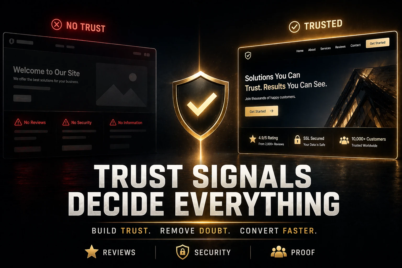
Trust signals are the visual, verbal, and structural cues that reduce uncertainty. They help a visitor believe the business is real, competent, and likely to deliver what it promises. These signals include client testimonials, clear contact information, recognisable branding, polished design, relevant certifications, consistent messaging, and transparent policies.
They work collectively rather than individually. One strong testimonial helps. A combination of testimonials, a visible phone number, a current copyright date, professional photography, and a clear refund or service guarantee helps considerably more. Trust is not built by a single element — it is the cumulative experience of a page that handles uncertainty well at every point.
Why Visitors Decide So Quickly
Most people do not read a website in a patient, methodical way. They scan. They compare tabs. They look for reasons to feel safe enough to continue — and reasons to leave. Research on web reading behaviour consistently shows that decisions about whether to stay or go happen within the first few seconds, before most of the page has even been read.
If the page feels thin, vague, outdated, or overly promotional in those first moments, confidence drops before the visitor ever reaches the offer. That is why trust signals need to appear early and consistently — not reserved for a testimonial section at the bottom that most visitors will never see.
Proof Beats Claims
A site can describe itself as trusted, experienced, or results-driven — but unsupported claims carry very little weight with a visitor who has no prior relationship with the business. Real proof carries far more. Client reviews that mention specific outcomes, case examples with concrete detail, portfolio visuals showing actual work, and before-and-after evidence all help transform marketing language into genuine credibility.
The distinction matters because visitors have developed strong filters for promotional language. Claims that are not supported by evidence are processed quickly as noise. Evidence — even modest, specific evidence — is processed as signal. The more a page shows rather than says, the more credible it becomes.
Clarity Also Builds Trust
Visitors trust websites that make basic information easy to find. Services should be described clearly. Location or service area should be stated. Response expectations should be set. Pricing approach — even if not exact figures — should be accessible. A clear, frictionless path to the next step should be obvious throughout.
Confusing navigation or vague copy often creates the opposite effect, even when the company itself is strong. Uncertainty about what a business actually does, who it serves, or how to get started is a trust gap — and trust gaps produce hesitation. Hesitation produces abandonment.
People rarely say they left because the site felt uncertain. They just leave.
Design Quality Influences Perception
Good design does not need to be flashy or expensive. It needs to look intentional. Clean spacing, readable typography, consistent colour use, and mobile responsiveness across devices all shape perceived professionalism before any copy is read.
A weak visual presentation can quietly lower trust even if the underlying offer is strong. Conversely, a visually coherent site creates a frame of competence that the copy then reinforces. Design is not decoration — it is the first layer of credibility the visitor encounters, and it shapes how everything that follows is received.
Common Trust Gaps
Missing or thin testimonials are the most common gap. But other trust killers accumulate quietly: outdated copyright dates, broken links, generic stock photography that looks nothing like the actual business, inconsistent tone between sections, and service pages so brief they raise more questions than they answer.
None of these issues may seem dramatic in isolation. Together, they create a pattern of small doubts that accumulate into a decision not to contact. A visitor will rarely be able to explain exactly why they did not enquire. They will simply say the site did not feel quite right — and that feeling comes from trust signals that were absent or broken.
What to Improve First
Start with the elements that have the most direct impact on conversion confidence: the contact path, social proof placement, homepage clarity, service page depth, and mobile usability. These five areas cover the majority of trust failures for most small business websites.
The goal is not perfection — it is confidence. A visitor does not need to believe a site is flawless. They need to believe the business is legitimate, capable, and worth their time. Getting those elements right, consistently, across the key pages of the site is what moves the trust needle from uncertain to convinced.
Turning Insight Into Action
The strongest marketing articles become useful when they change the next decision. The goal is not just to understand the principle. It is to turn that principle into clearer priorities, better execution, and stronger results over time.
Need a Site That Feels More Credible?
We help businesses strengthen trust across messaging, structure, proof, and conversion flow so visitors feel safer taking the next step.
Strengthen My Site →