Mobile optimisation used to sound like a technical upgrade — something to get to eventually. Now it is basic business hygiene. For the majority of brands, the first serious impression happens on a phone screen, in a distracted moment, with one thumb scrolling. That reality demands a different kind of design thinking.
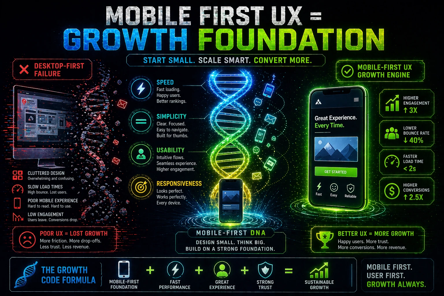
Why Mobile Comes First Now
Users browse, compare, message, and buy from phones constantly. That means a business is judged in a smaller, faster, more distracted environment than ever before. Design decisions that feel acceptable on a 1440-pixel monitor become frustrating on a 390-pixel phone screen — where spacing is tighter, attention is shorter, and patience for friction is nearly zero.
The shift is not just behavioural. It is algorithmic. Google's mobile-first indexing means the mobile version of a site is what determines search rankings across all devices. A business optimising only its desktop experience is optimising for a metric that search engines are no longer primarily measuring.
Readability Is Part of Conversion
Dense paragraphs, weak line-height, tiny touch targets, and awkward forms all create friction on mobile. A page that is readable and navigable on a laptop often becomes exhausting on a phone because it was designed for mouse precision rather than thumb reach.
Mobile-friendly readability means larger base font sizes, generous line spacing, short paragraphs, and ample padding around interactive elements. These are not aesthetic choices — they are functional ones. A page that is hard to read will not be read. A page that is read but hard to act on will not convert.
Navigation Must Stay Simple
People on phones usually want orientation fast. If menus are cluttered, category labels are ambiguous, or the path to the most important page requires multiple taps, the visitor can lose patience before they find what they came for.
Mobile navigation should be ruthlessly prioritised. The most valuable destinations should require the fewest steps. Secondary content should not compete with primary pathways for visibility. A hamburger menu that opens into ten equal-weighted options is a navigation that has not made any decisions — and leaves the visitor to make them all.
Speed Feels Like Trust
Slow pages create doubt before the content is even visible. They make the business feel less polished, less responsive, and less reliable — impressions that form in the 2 to 3 seconds a user waits for a page to load. Google's Core Web Vitals research shows a direct relationship between page load time and bounce rate, with even one-second delays producing measurable drops in conversion.
Speed is not purely a technical metric. It is a brand signal. A fast site feels like it was built by people who care about the user's time. A slow site, regardless of how well it looks once loaded, starts every visit in a deficit of credibility.
A site that works beautifully on desktop but poorly on phone is only half working — and that half is usually the wrong one.
Calls to Action Need Better Placement
On mobile, the best next step should feel obvious without dominating the entire screen. If action buttons are buried below multiple scrolls of content, surrounded by competing links, or sized too small for a reliable tap, conversions suffer regardless of how good the offer is.
Mobile CTA placement deserves specific attention — not just inheriting whatever the desktop layout decided. Sticky footer CTAs, well-spaced inline buttons, and a clear repeat of the primary action below key sections of content tend to outperform layouts designed exclusively with desktop scroll depth in mind.
Forms Should Respect Friction
Long forms are considerably more painful on phones. Each additional field is a moment where a user on a small keyboard reconsidering whether the effort is worth it. The data is clear: every unnecessary form field reduces completion rates.
Businesses should ask only for what is truly necessary at the moment of first contact. A name and email address gets more completions than a name, email, phone number, company size, and message — even if the longer form would be more useful internally. Progressive profiling — collecting additional information after the initial conversion — nearly always outperforms the front-loaded approach on mobile devices.
Mobile First Means Priority First
A strong mobile experience forces better decisions about hierarchy, clarity, and usefulness. When there is limited space and limited attention, everything that belongs on the page must earn its place. That discipline usually improves the whole website — not just the phone version — because it eliminates the content padding and design excess that tend to accumulate unchecked on larger screens.
The businesses that approach mobile first as a strategic constraint rather than a technical compliance exercise tend to end up with simpler, clearer, more effective sites across all devices. Mobile is not a smaller version of the real website. For most visitors today, it is the real website.
Turning Insight Into Action
The strongest marketing articles become useful when they change the next decision. The goal is not just to understand the principle. It is to turn that principle into clearer priorities, better execution, and stronger results over time.
Need a Better Mobile Experience?
We help businesses strengthen mobile clarity, page flow, and conversion paths so the site performs where attention now starts.
Improve Mobile UX →